Today, I want to chat about something that’s not just about making things look pretty – it’s about the power of colors and how they can seriously boost goodwill and return on investment. Yes, we’re diving into the world of color theory!
Now, I know it might sound a bit artsy-fartsy, but stick with me because this is more than just picking your favorite color for a logo. Color theory is like the secret sauce behind what makes certain brands stand out, be remembered, and ultimately make some serious cash.
By understanding the psychology of color, businesses can use it to create brand recognition and customer loyalty.
Using visual marketing solutions such as logos designs, corporate identity and emotional branding are great opportunities that will help ROI optimization while creating a recognizable Visual Appeal for customers.
Goodwill generated by working with color theory provides long-lasting rewards like brand recognition & Visual Appeal leading to improved returns from increased conversions and sales cycle efficiency.
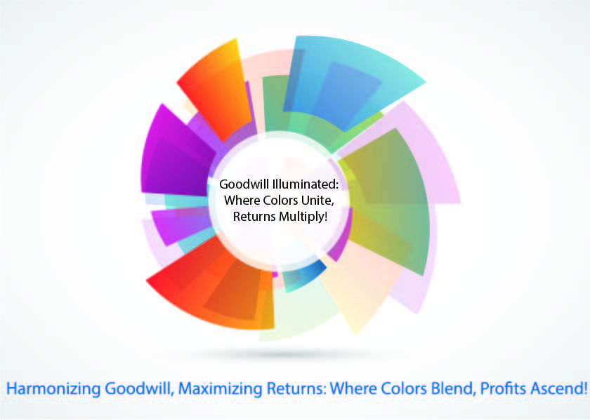
NEWTON’S COLOR DISC
Newton’s disc-full range of color from violet to red, as produced by shining white light through a prism forms a spectrum. A rainbow is a spectrum made by the rain drops acting as a prism for sunlight. The colors thus obtained are VIBGYOR- Violet, Indigo, Blue, Green, Yellow Orange and Red
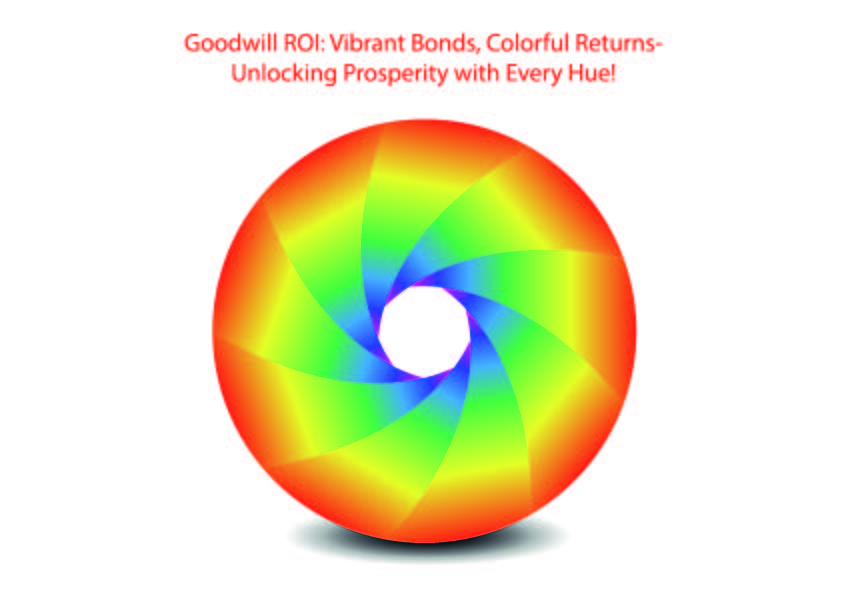
By understanding the emotional impact of colors, respecting cultural significance, and leveraging color for effective communication, businesses can generate goodwill and enhance return on investment. Strategic use of color contributes to brand recognition, sets products apart in the market, and fosters positive emotional connections with consumers.
PRANG’S COOR DISC
Prang’s color disc, named after the American artist and educator Louis Prang, is a tool designed to help individuals understand color relationships and mixing. Similar to Newton’s color disc, Prang’s version typically consists of a rotating disc with segments representing primary and secondary colors.
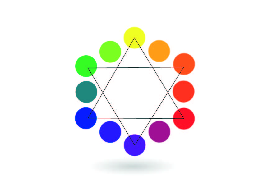
Understanding and applying color theory in branding, design, and marketing can have a significant impact on generating goodwill and a positive return on investment. By leveraging colors strategically, businesses can enhance brand identity, influence consumer perceptions, differentiate themselves in the market, and communicate effectively with their target audience.
COLOR WHEEL
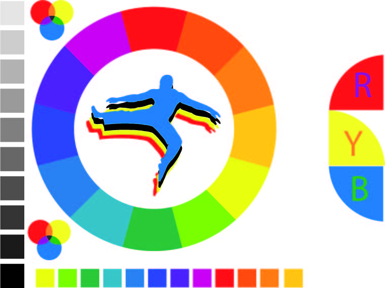
The color wheel is a fundamental tool in color theory, organizing colors in a circular arrangement based on their chromatic relationships. It provides a visual representation of how colors interact and can be combined to create various harmonies. The traditional color wheel typically includes primary colors (red, blue, and yellow), secondary colors (green, orange, and purple), and tertiary colors, which result from mixing a primary color with a neighboring secondary color.
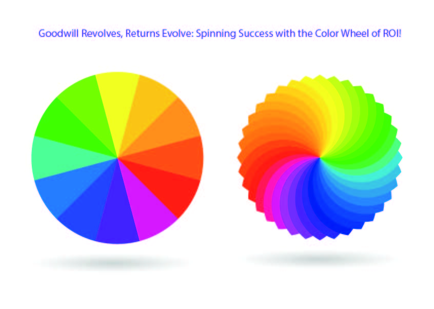
By understanding the emotional impact of colors, tailoring choices to cultural contexts, and ensuring consistency in branding, businesses can leverage color theory to create a lasting and positive impression on consumers.
PRIMARY COLOR
Primary colors are foundational hues that cannot be created by mixing other colors together. In traditional color theory, the three primary colors are red, blue, and yellow. These colors serve as the building blocks for creating a wide range of other colors through the process of color mixing.
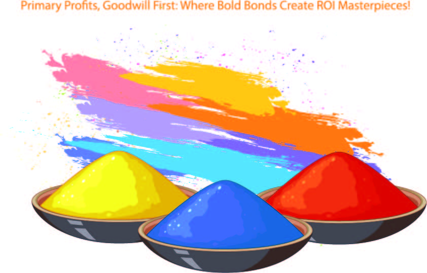
Primary colors are foundational in color theory and serve as the basis for creating a wide array of colors. It influences brand recognition, emotional associations, effective communication, cultural sensitivity, and product differentiation, all of which contribute to a brand’s success in the market.
SECONDARY COLOR
Secondary colors are created by mixing two primary colors together. When these primary colors are combined in specific proportions, they produce three secondary colors: green (blue + yellow), orange (red + yellow), and purple (red + blue). Understanding secondary colors is a fundamental aspect of color theory, with practical applications in art, design, and various other fields.
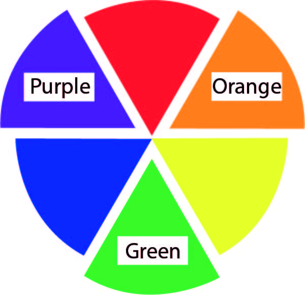
Understanding secondary colors and applying color theory is crucial for businesses aiming to generate goodwill and achieve a positive return on investment. Secondary colors offer versatility, emotional impact, and the potential for brand differentiation. Whether used in design, branding, or marketing materials, a thoughtful and strategic approach to color can contribute to a positive consumer perception, increased brand loyalty, and ultimately, a successful and profitable business.
TERTIARY COLORS
Tertiary colors are created by mixing a primary color with a neighboring secondary color on the color wheel. Tertiary colors, then, result from combining a primary color with a secondary color, resulting in hues such as red-orange, blue-green, and yellow-purple. Understanding tertiary colors adds depth and nuance to the color palette, allowing for more sophisticated and nuanced use of color in various creative endeavors.
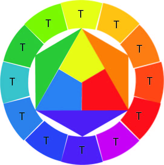
In conclusion, understanding and applying color theory, including the strategic use of tertiary colors, is essential for businesses aiming to generate goodwill and achieve a positive return on investment. Tertiary colors add depth, sophistication, and emotional resonance to a brand’s visual language. Whether used in branding, product design, or marketing materials, a thoughtful approach to color can contribute to a positive consumer perception, increased brand loyalty, and overall business success.
INTERMEDIARY COLORS
The term “intermediary colors” is not a standard term in color theory. However, it seems to refer to colors that fall between primary and secondary colors or between secondary and tertiary colors. If we consider these as colors created through intermediate steps in the color mixing process, such as blending two adjacent colors on the color wheel, we can explore their significance in color theory.

A diverse and well-thought-out color palette, including intermediary colors, contributes to creative expression, visual engagement, and brand differentiation. Leveraging color theory effectively can enhance consumer perceptions, foster brand loyalty, and ultimately contribute to a positive return on investment.
SUBTRACTIVE MIXTURE OF COLORS
The subtractive mixture of colors is a concept in color theory that pertains to how colors combine when using pigments or dyes. Unlike additive color mixing, which involves combining different colors of light (as seen in digital displays and screens), subtractive color mixing occurs when pigments or dyes are mixed together, absorbing certain wavelengths of light and reflecting others.
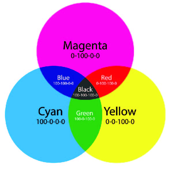
In summary, understanding subtractive color mixing and applying color theory principles is crucial for businesses, especially in areas such as branding, design, and print media. By creating visually appealing and consistent materials, businesses can enhance brand recognition, build positive relationships with consumers, and potentially achieve a positive return on investment.
WARM AND COOL HUES
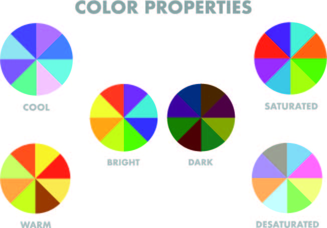
Warm and cool hues are categories of colors based on their perceived temperature or psychological associations. Understanding and effectively using warm and cool colors is a fundamental aspect of color theory, influencing various applications in art, design, branding, and marketing.
WARM HUES:
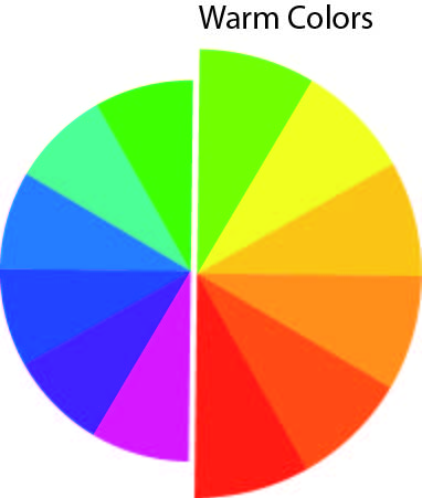
Warm hues are colors that evoke a sense of warmth, energy, and vibrancy. They are often associated with sunlight, fire, and heat. Examples of warm hues include reds, oranges, yellows, and warm-toned browns.
COOL HUES:
Cool hues, on the other hand, create a sense of calm, tranquility, and coolness. They are often associated with water, sky, and nature. Examples of cool hues include blues, greens, and cool-toned purples.
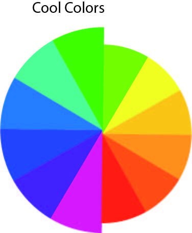
When applied strategically, warm and cool colors contribute to a positive emotional response, enhance visual harmony, and play a significant role in generating goodwill and a positive return on investment for businesses.
COLOR HARMONY
Color harmony is a concept in color theory that refers to the visually pleasing arrangement of colors in a way that is balanced, aesthetically pleasing, and evokes a desired emotional response. Achieving color harmony involves understanding color relationships, contrasts, and the effective combination of colors to create a unified and cohesive visual experience. There are two types of color schemes that can be produced with the help of the color wheel.
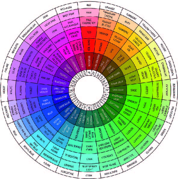
Related color harmony – monochromatic , achromatic, analogous or adjacent colors
Harmony of contrasting colors – Complementary, Split Complementary, Triadic Harmony, tetradic harmony, square color harmony.
1. MONOCHROMATIC
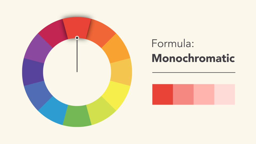
Monochromatic color schemes are based on a single color, using various shades, tones, and tints of that color. In this scheme, one hue is extended by adding white, black, or gray to create variations in lightness and darkness. Monochromatic designs often convey simplicity, elegance, and a cohesive visual identity. When strategically applied in branding and marketing, monochromatic designs can contribute to positive consumer perceptions, brand consistency, and ultimately, a positive return on investment.
2. ACHROMATIC
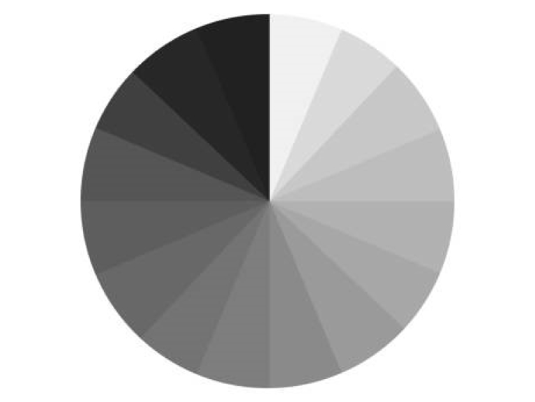
Achromatic color schemes are characterized by the absence of color, using only black, white, and shades of gray. Achromatic designs are often associated with simplicity, elegance, and a clean aesthetic.When strategically applied in branding and marketing, achromatic designs can contribute to a positive consumer perception, brand consistency, and ultimately, a positive return on investment. Their timeless and adaptable nature makes them a valuable tool for businesses looking to create a lasting and impactful visual identity.
3. ANALOGOUS OR ADJACENT COLORS
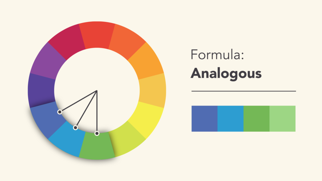
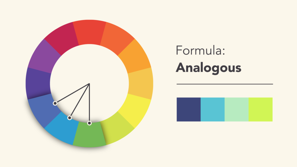
Analogous colors, also known as adjacent colors, are hues that are located next to each other on the color wheel. These color schemes create harmonious and visually appealing combinations, as they share similar undertones and are often found together in nature. It offers visual harmony, natural appeal, and the potential to create specific moods. Their ability to create cohesive and aesthetically pleasing designs makes them a valuable asset for businesses aiming to leave a lasting and positive impression on their target audience.
4. COMPLEMENTARY COLORS
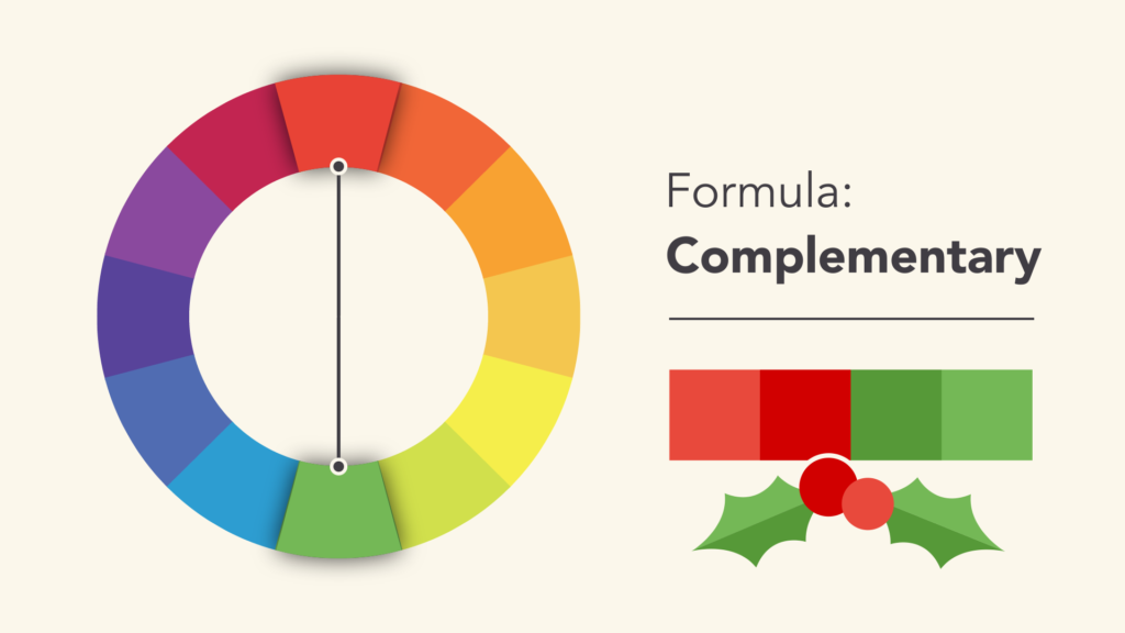
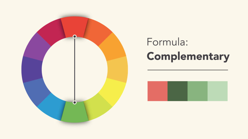
Complementary colors are pairs of colors that, when combined, create a strong contrast and reinforce each other. These color pairs are opposite each other on the color wheel, and the high contrast between them can produce vibrant and visually striking designs. Understanding and leveraging complementary colors in design and marketing is crucial for businesses aiming to create visually impactful and memorable materials. By strategically incorporating these color schemes, businesses can enhance their visual communication, brand recognition, attract attention, and influence consumer perceptions, and stand out in competitive markets, contributing to long-term success and goodwill.
5. SPLIT COMPLEMENTARY COLORS
Split-complementary colors are a variation of the complementary color scheme. In a split-complementary scheme, instead of using one color and its direct opposite, it involves one base color and the two colors adjacent to its complementary color on the color wheel. This creates a color palette that maintains the high contrast of complementary colors while offering a bit more variety and subtlety.
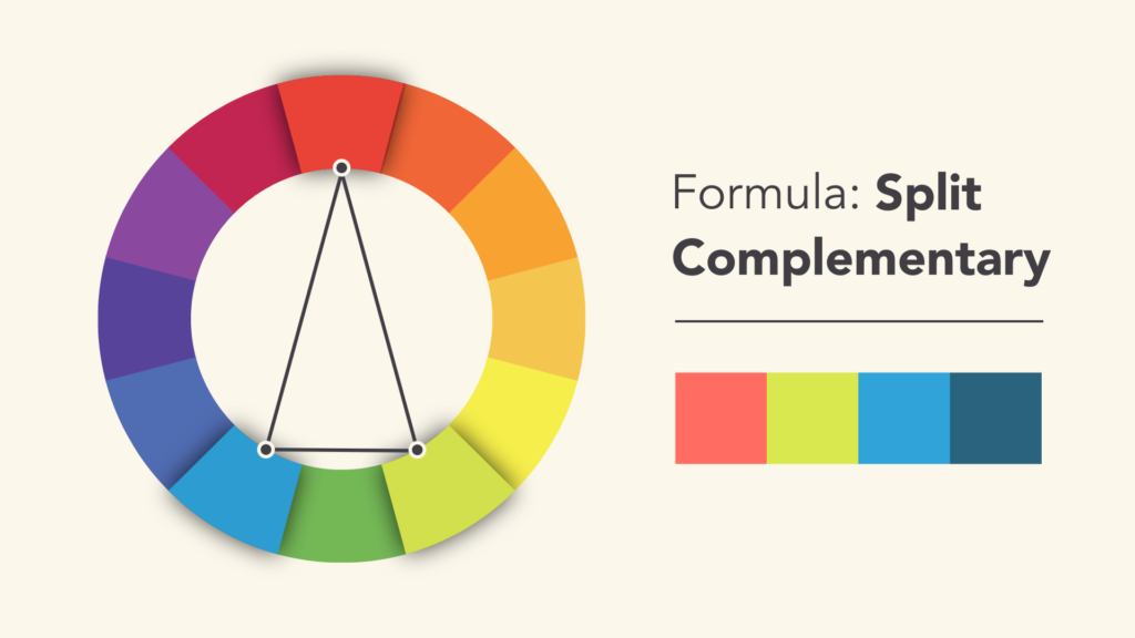
In conclusion, understanding and strategically applying split-complementary colors in design and branding can lead to visually appealing and dynamic outcomes. By embracing the balanced contrast and rich color palette offered by split-complementary schemes, businesses can enhance their visual communication, differentiate their brand, and contribute to positive consumer perceptions, ultimately influencing return on investment and fostering goodwill.
6. TRIADIC HARMONY
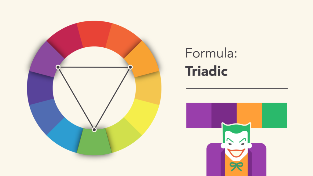
Triadic harmony is a color scheme in which three colors that are evenly spaced around the color wheel are used together. This creates a balanced and visually appealing combination of colors. offering vibrancy, balance, and versatility. When strategically applied in branding and marketing, triadic colors can contribute to positive consumer perceptions, brand recognition, and ultimately, a positive return on investment. Their ability to create cohesive and visually appealing designs makes them a valuable asset for businesses aiming to leave a lasting and positive impression on their target audience.
7. TETRADIC HARMONY
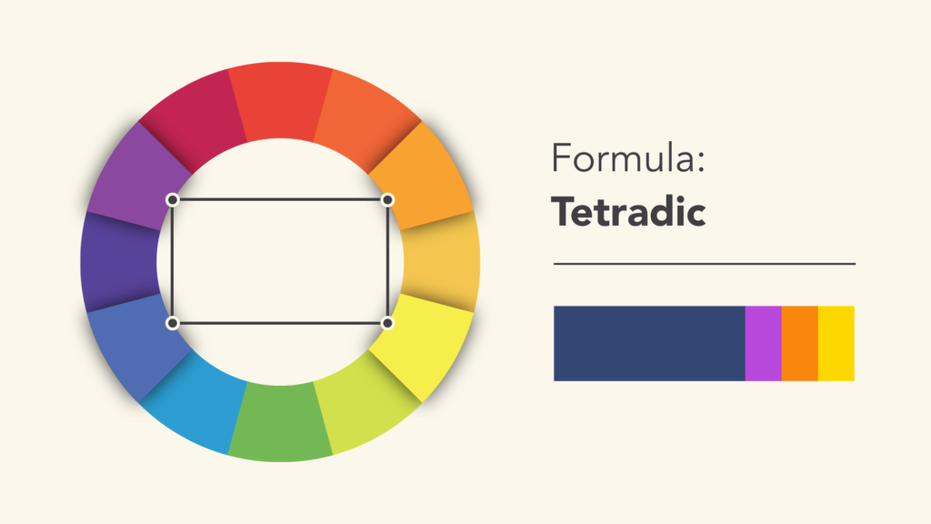
Tetradic harmony, also known as double-complementary or rectangular color scheme, is a color scheme that involves four colors together in the form of two complementary color pairs. These colors are evenly spaced around the color wheel, creating a rectangle. offering a rich palette, balanced contrast, and versatility. When strategically applied in branding and marketing, tetradic colors can contribute to positive consumer perceptions, brand recognition, and ultimately, a positive return on investment.
8. SQUARE COLOR HARMONY
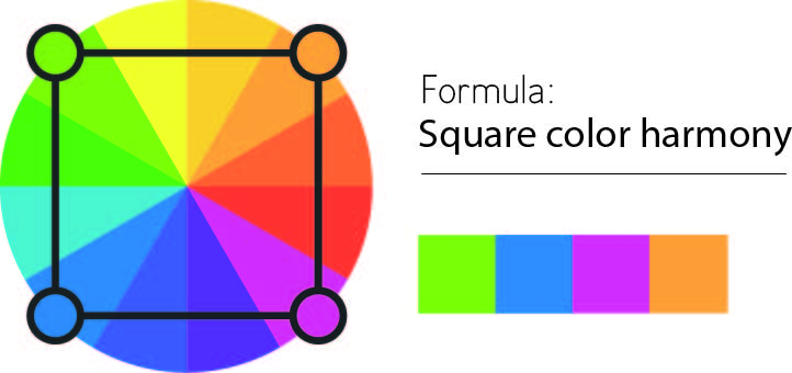
Square color harmony, also known as quadrilateral or tetradic color scheme, involves four colors together in the form of two complementary color pairs. These colors are evenly spaced around the color wheel, creating a square. Understanding and effectively using square color harmony is a fundamental aspect of color theory, with applications in various creative fields such as art, design, branding, and marketing.
GRAYSCALE
Grayscale, often referred to as black-and-white, is a color scheme that uses shades of gray ranging from black to white without any color saturation. While grayscale lacks the vibrancy of full-color palettes, it plays a significant role in design, photography, and art. Understanding grayscale and its application within the broader context of color theory is crucial for creating impactful visual content. Additionally, grayscale designs can contribute to goodwill and potentially influence return on investment (ROI) in various ways.
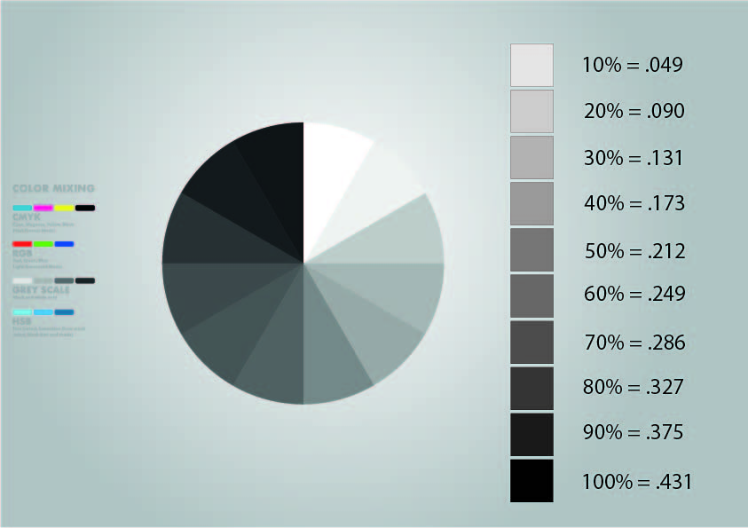
Key Aspects of Grayscale:
Lack of Color Saturation
Emphasis on Tonal Values
Timeless Aesthetic
Focus on Contrast and Composition
Simplicity and Clarity
Versatility

Grayscale, despite its lack of color, is a powerful and versatile tool in the realm of design and visual communication. When strategically applied, grayscale designs can contribute to goodwill by conveying sophistication, timelessness, and clarity. Furthermore, the adaptability and simplicity of grayscale can positively impact return on investment by enhancing brand recognition, promoting a focus on content, and maintaining a professional and consistent visual identity.
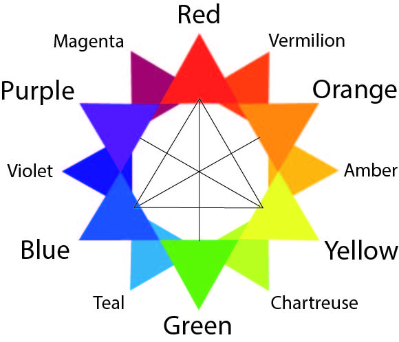
COLOR TRIANGLE
Referring to the concept of a color triangle in the context of a color wheel or color model, provide information on color theory and its broader application in generating goodwill and return on investment (ROI). Return on Investment (ROI) and Goodwill:
Memorability
Positive Brand Perception
Consumer Trust
Consumer Loyalty
Adaptability
Color Theory Overview:
Color theory is a framework that explores how colors interact, combine, and influence human emotions and perceptions. It involves the color wheel, color harmony, and the psychological effects of different colors. Strategic color choices contribute to goodwill and, when aligned with overall branding efforts, can positively impact return on investment by influencing consumer perceptions, engagement, and loyalty.
TINT, SHADE & TONE
Tint, shade, and tone are terms used to describe variations of a color, each with its unique characteristics.
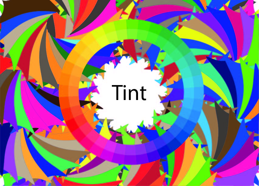
TINT :
Definition: A tint is a color that has been lightened by adding white to it. Tints are often perceived as softer and more pastel-like than the original hue.
Application: Tints are commonly used to create a sense of lightness, delicacy, and innocence in designs. They are popular for conveying a fresh and airy aesthetic.
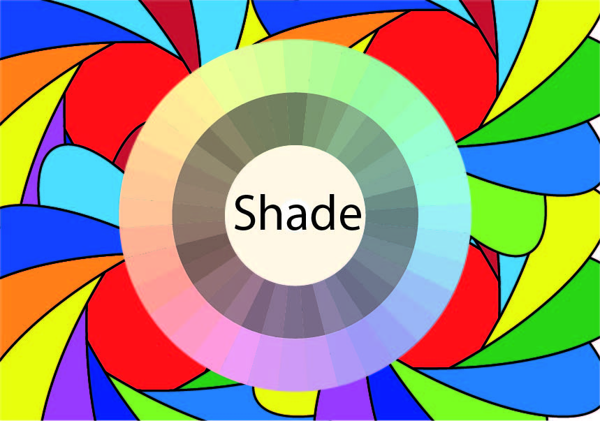
SHADE :
Definition: A shade is a color that has been darkened by adding black to it. Shades appear deeper and more intense than the original hue.
Application: Shades are employed to add drama, depth, and sophistication to designs. They are often associated with richness and can convey a sense of mystery or seriousness.
TONE :
Definition: A tone is a color that has been altered by adding both white and black to it. This results in a muted and desaturated version of the original hue.
Application: Tones are versatile and can evoke a range of emotions. They are often used to create a harmonious and balanced color palette, offering subtlety and nuance.
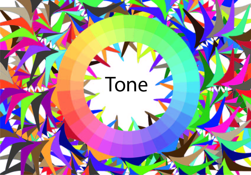
A nuanced understanding and strategic application of tints, shades, and tones are essential components of effective color theory. When employed thoughtfully in branding and marketing, these color variations contribute to visual harmony, emotional connection, and consistency, ultimately impacting goodwill and positively influencing return on investment.
INTERMEDIATE COLORS
Intermediate colors are created by combining a primary color with a neighboring secondary color on the color wheel. This results in a set of six tertiary colors: red-orange, yellow-orange, yellow-green, blue-green, blue-violet, and red-violet.
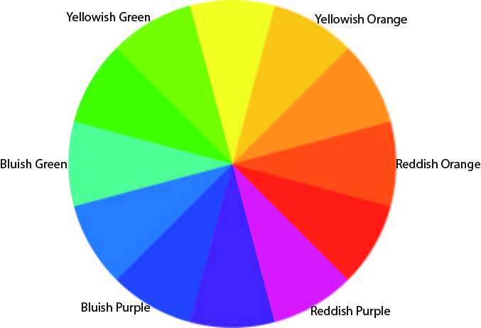
Understanding and strategically utilizing intermediate or tertiary colors in design and branding can lead to visually appealing and dynamic outcomes. By embracing the balanced and nuanced qualities of these colors, businesses can enhance their visual communication, differentiate their brand, and contribute to positive consumer perceptions. This, in turn, has the potential to influence return on investment and foster goodwill among the target audience.
SIMULTANEOUS CONTRAST
Simultaneous contrast is a phenomenon in color theory where the perception of one color is affected by the presence of another color. When two colors are placed side by side, they can influence each other, altering the way they are perceived by the human eye. This effect is particularly pronounced when contrasting colors are used.
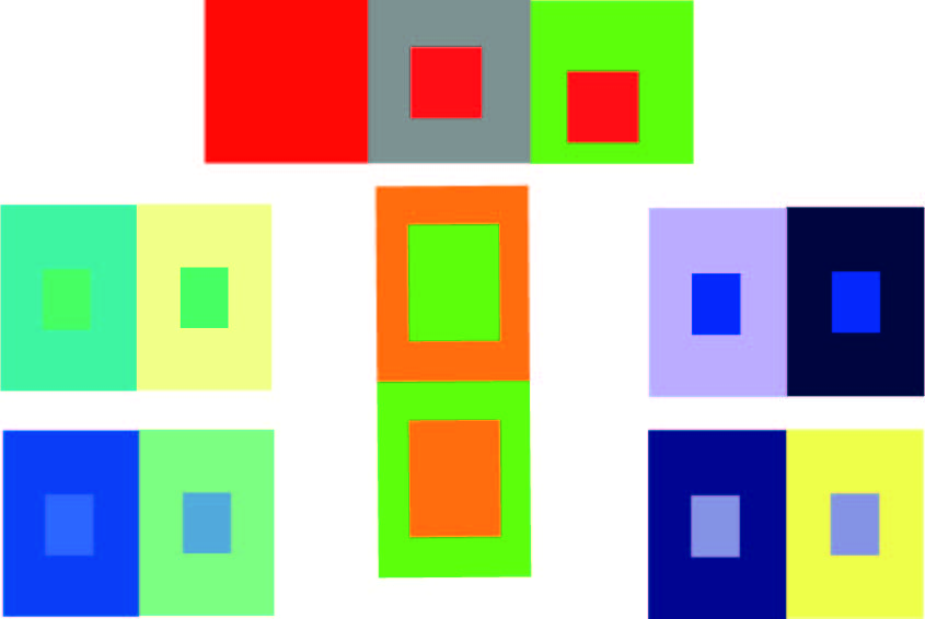
Simultaneous contrast occurs when the perception of a color is influenced by the presence of adjacent colors. This phenomenon can cause colors to appear more intense, shift in hue, or create the illusion of movement. By creating visually appealing and memorable experiences, businesses can foster goodwill and potentially increase return on investment through effective and engaging visual communication.
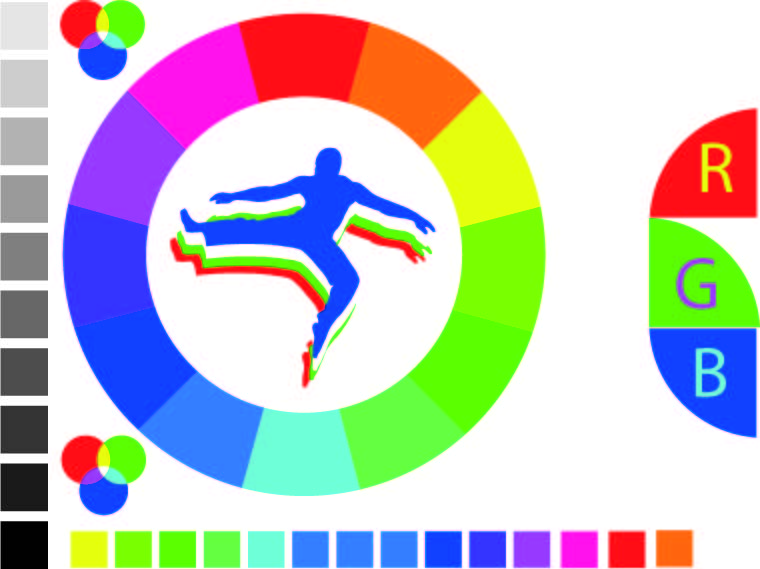
The RGB Color Wheel
The RGB (Red, Green, Blue) color wheel represents the 3 light sources used to produce colors on a TV or computer screen.
Primary colors are Red, Green, and Blue.
Secondary colors are created by mixing primary colors:
Red and Green= Yellow
Green and Blue = Cyan
Blue and Red = Magenta
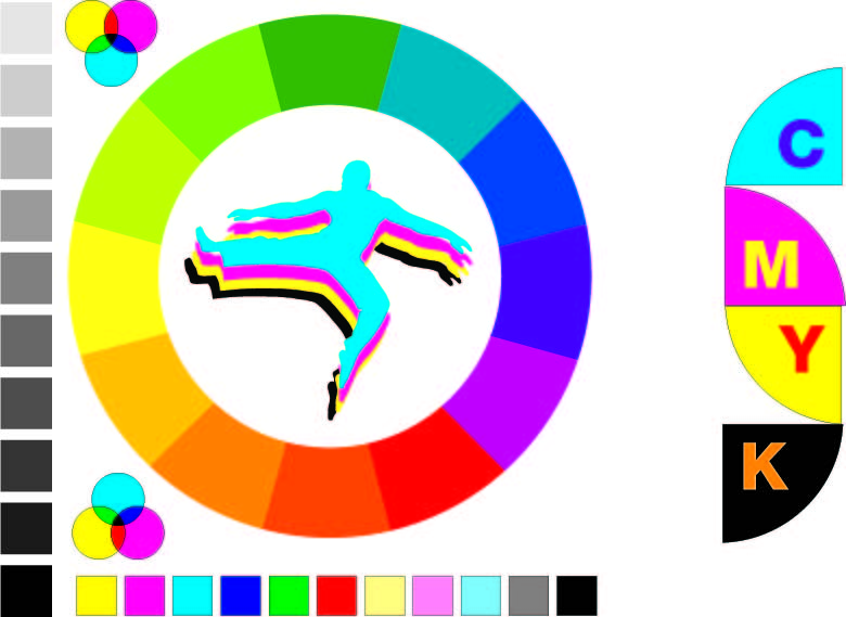
The CMY(K) Color Wheel
The CMY(K) (Cyan, Magenta, Yellow) represent the colors used to print on paper.
The primary colors are Cyan, Magenta, and Yellow.
Secondary colors are created by mixing primary colors:
Cyan and Magenta = Blue
Magenta and Yellow = Red
Yellow and Cyan = Green.
The RYB Color Wheel
The RYB (Red, Yellow, Blue) color wheel is used by painters, artists and designers for blending pigment colors.
The 3 primary colors are Red, Yellow, and Blue.
Secondary colors are created by mixing primary colors.
The 3 secondary colors are Orange, Green, and Purple.
Red and Yellow = Orange
Yellow and Blue = Green
Blue and Red = Purple.
